Wednesday 12 May 2010

Key Terms

HD
BluRay
3D
Four Quadrant
Niche
35mm Print
Convergence
Encryption Codes
Escapism
Social Realism
Merchandising
Streaming
Stock Writers
Lord Puttnam
Shane Meadows
Tim Bevan
Categories
Piracy
Prefabricated
CGI
Software/Hardware
BFI
BBFC
ATL/BTL Advertising
Synergy
Viral
Product Placement
Vertical/Horizontal Integration
Conglomerate
DSN Sites
Distribution
Exhibition

Monday 10 May 2010

How To Use My Blog

To access my final magazine piece, you can click on the 'Finals' label under the 'Labels' heading.
Alternatively, you can access it by clicking on the 'AS Coursework' label under the 'Labels' heading, and scroll down past my Evaluation Questions, and it is directly underneath these.(which you may also like to look at, and can also be accessed by clicking the relevant question number you would like to see under the 'Labels' heading)
you can use the Label's to easily and quickly navigate around my page to the work you desire to look at.

Thursday 15 April 2010

1. In what ways does your media product use, develop or challenge forms and conventions of real media products? (i.e. of music magazines)

2. How does your media product represent particular social groups?

3. What kind of media institution might distribute your media product and why?

4. Who would be the audience for your media product?

5. How did you attract/address your audience?

6. What have you learnt about technologies from the process of constructing this product?

7. Looking back at your preliminary task (the continuity editing task), what do you feel you have learnt in the progression from it to full product?

Thursday 25 March 2010

Magazine Finals.


Masthead Change

i've decided to change the name of the magazine from Afterbirth to Aftershow, because it suits the genre of magazine that my magazine has evolved into,a more rocky live music genre.

Wednesday 24 March 2010

2012 & Hot Fuzz

Wednesday 17 March 2010

Life on Mars - Representation of gender and ethnicity


In the first part of the clip, when the police turn up, their is an upbeat fast music playing in the background to emphasize the power of the police, also their are many low angle shots of the policeman whereas the irishman gets a midshot, to show the power the english police have. the Irish man expresses how his father couldnt get a real job due to the racism in the country. Irish man looks rough, dirty clothes and a beaten up face (probabty by the police) showing the ethnic injustice of the situation. the Irish man also refers to how he can't get his own business and that all the english allow people of his community to do is labour or the 'jobs the english don't want to do' and makes reference to 'shovelling shit' to emphasize this point.
In the next part analysed, one of the main policemen stops an asian man who is walking accross the road with a t.v. under the assumption that he had stolen it based on the colour of his skin. also, the main p[olicemen makes a reference to the sari that the asian woman is wearing 'a bit parky to be out in just a nighty', i believe this is a general misunderstanding as he believes they aren't equal to the english and therefore doesnt understand the different societal norms within the different cultures.
In the bar, the music played is very soft and mellow making the pub a peaceful environment when they are celebrating, to suggest a calm accomplished feel. there is a black man who is possibly from the carribean due to his strong accent, and has dreadlocks showing the stereotypical element of their culture through an english point of view, also as another racial comment about the irish, the main policeman says 'the pub is the safest place from the IRA because they're not gunna bomb their own'.

Monday 15 March 2010

Dude, Where's My Car (trailer) Sound Analysis

  • Non diegetic sound, a sort of jazz music, at the start of clip with opening of 20th century fox and voiceover telling the plot of the film.
  • Voiceover consistent throughout the trailer.
  • Diegetic sound where alarm clock goes off and Jesse (Ashton Cutcher) wakes up and when he runs out of the room and hits the opposite door. Non diegetic sound is in the background but still fading away, a sort of jazz music, same as the first part.
  • Diegetic sound as there is Dialogue between Jesse (Ashton Cutcher) and Chester (Seann William Scott) about where Jesse's car is also the sound of birds singing in the trees is heard. no Non diegetic sound at this point.
  • Non diegetic sound changes to a more rocky tune of electric guitars as the clip flashes from the Diegetic sound of Jesse and Chester talking to Christie Boner (Kristy Swanson) to a strip club as they are trying to revisit what they did the previous night as the Non Diegetic consistent voiceover inform us
  • Diegetic Sound,Emphasis on the sound of the policeman hitting the dummy human

Thursday 11 March 2010

Draft Piece Remade


I have decided to change my colour scheme, and main image as from my feedback i have found that beau does not convey the right amount of energy for my genre of magazine. Instead, i have used Beth Greaves, who gives my magazine a more hardcore rock effect and appeals to the male audience due to the raunchyness of the main image. this is just a rough copy as it will get edited further during production but this is now my idea for my magazine.

The Soloist Research & Production Practices

The Soloist

The Soloist is a 2009 drama film which was directed by Joe Wright, and starred Jamie Foxx and Robert Downey Jr. The screenplay was made by Susannah Grant and is based on the book, The Soloist by Steve Lopez. The film is based on the true story of Nathaniel Ayers, a musician who develops schizophrenia and becomes homeless.

Jamie Foxx plays Nathaniel Ayers, who is a cello prodigy, and Robert Downey Jr plays the part of Steve Lopez, a Los Angeles Times columnist who discovers Ayers and writes about him in the newspaper. The film was released in theatres on 24 April 2009 and on DVD and Blu-Ray on August 5.

Plot

The Soloist is based on the true story of Nathaniel Ayers who is a musical prodigy that develops schizophrenia during his second year at Juilliard School. Ayers becomes homeless and plays a two-stringed violin in downtown Los Angeles. One day Steve Lopez an LA Times Columnist meets Nathanial and decides to write a newspaper column for the Los Angeles Times about him and his homelessness. An old woman takes sympathy and sends Steve a cello for Nathaniel to play. In attempting to help Ayers, Lopez is forced to grapple personally with the complex issues and frustrations surrounding the thousands of mentally ill who are homeless on the streets of L.A.

Cast

Jamie Foxx as Nathaniel Ayers
Robert Downey Jr. as Steve Lopez
Catherine Keener as Mary Weston (formerly Mary Lopez)
Tom Hollander as Graham Claydon
Lisa Gay Hamilton as Jennifer
Rachael Harris as Lopez's co-worker
Jena Malone as a lab technician.
Diana Gomes as a Psychologist
Stephen Root as Curt Reynolds
Marcus Carl Franklin as Young Nathaniel Ayers
Lorraine Toussaint as Flo Ayers


Production

The Soloist, who is directed by Joe Wright, was written by Susannah Grant, based on a series of columns written by Los Angeles Times columnist Steve Lopez, who wrote about the plight of Nathaniel Ayers, a musician with schizophrenia, and eventually was chronicled in Lopez' book, The Soloist. Grant drew elements of the story from a book written by Lopez, which got published in the spring of 2008. The film was budgeted at $60 million, twice the budget amount of Atonement. Production began in January 2008 and was filmed mostly in Los Angeles, with some scenes shot in Cleveland.


Box office

On its opening weekend, the film opened #4 behind Fighting, 17 Again, and Obsessed, grossing $9,715,000 in 2,024 theaters with a $4,800 average per theater. The film went on to only recover about half of its total budget bringing in $31,720,158. This was blamed on the film's initial release date being postponed, as well as the film's release coming one week before the 2009 summer movie season.

Monday 8 March 2010

Magazine Market Research

Magazine Market Research Questions 3


Magazine Market Research Questions 2


Magazine Market Research Questions


Magazine Market Research Questions 4


Magazine Market Research Questions for Andy 5

Wednesday 3 March 2010

Double Page Spread analysis of effects/colour schemes

i like this magazine for its powerful image on a plain white background, which is a low angle shot emphasizing the power of the picture. the bright colour scheme of black/ limegreen catches the eye of the readers and draws them in to read the article. i could incorporate the bright colours into my magazine to help catch the eye of the reader.


i like this double page spread, for the sepia colour effect making every picture more brown, i also like how more than one live image of the stars are used on this magazine. the colour scheme follows the generic conventions of the genre black/ white and red. i could use effects such as sepia or black and white to make pictures blend in nicely with the page, whilst having a strong eyecatching effect.


I like this double page spread for many reasons. Firstly it doesnt have too much writing, and the font colour matches the main image. also i like the font style on this magazine and also its simple, not too harsh colour pallette. it is very black and white with a splash of red to make the magazine exciting even with its plain main colour pallette. in my magazine i shall try incorporate the colour that my model is wearing into the text colour pallette or vise versa for a greater effect.

Contents Page analysis of effects/colour schemes

This magazine contents page is very simplistic but effective, it uses a black and red colour scheme for text to emphasize the magazine, also it uses dark pictures giving it a rocky feel, with page references to where they are in the magazine, which assumes that the readers of the magazine know who the stars are, and therefore there is no text to go with the pictures. i believe i can incorporate the darker elements from these pictures into my magazine, to give my magazine a more obvious and specific genre.


This magazine contents page is crammed full of writing, showing the headings of sections in the magazine and then the main topics underneath these headings, also this magazine uses pictures with text underneath to highlight the important articles in the magazine. this magazine also has a message from the editor at the top, with the front cover of the magazine posted in the corner. the contents page has a yellow/black/ white colour scheme which is seen in its writing. i believe i could use a few smaller images on my contents page to break it up and show its more rock/metal genre, also i could use a quote at the top much like the one from Kirk Hammett.


this 'Reviews' contents page has many elements that i would like to incorporate into my contents page, such as the simple main image on the front, which clashes with the green white colour scheme. i also like the simplicity of this page as it has one main image, with a smaller one over the top at the bottom, and a simple plain list of what it has to offer. the main image incorporates the genre of rock/metal with the style of hair and clothing the people are wearing, also the girls dress clashes with the green to draw the readers attention to the image. also with the Reviews in a large font at the bottom of the page, it attracts the readers eye and makes it a more interesting read being positioned differently from a generic music magazine, also it helps the image as the faces aren't blacked by the writing which is the most important feature of the picture for the reader.

Afterbirth Draft Piece Feedback

Work includes the following (raken from the AS portfolio schedule):
Mood Boards
Examples of other texts/style models
Analysis of magazine covers
Title of product (can be a working title)
25 word pitch
pitch feedback (not on blog)
Shots of work on magazine cover including photo shoot
Complete mock version of cover/ contents page/ double page spread and draft article

Comment:
Genre of magazine is not clear. Cover star (he looks too polite.) needs to really look the part. Also colour scheme is a bit dull and wishy washy. It needs to have more impact. Font is very good though. Need to establish a clearer link between research and end product. Add price/date/issue number. Must include a variety of shots across the pages.
look at your research examples for contents + double page spread and see what you can use. try a few layouts ( and post them) Also do the same for colour pallettes.

Research/Planning level: 3
Practical Draft level: 2

Wednesday 24 February 2010

Editing Techniques Paramore - The Only Exception


This music video starts with Hayley sleeping next to a man on a sofa, suggesting a loving happy atmosphere of harmony. when hayley wakes up, using a jump cut from a closeup of them on a sofa to an establishing shot as she gets up off the sofa and slowly zooms back in on hayley, which then uses a jump cut to a low angle close up of Hayley writing a letter, which could portray power to the audience which then uses a jump cut again to the 'Im Sorry' written on the letter which cross cuts so when the camera is back to Hayley, she's walking out of the room.

as she is about to leave the room she stops and the camera uses the cutaway technique to show us she is looking at the man still asleep on the sofa before turning away and exiting the room, suddenly the camera cuts to the other room with her father in, which jump cuts to a flashback of her hugging her Father, and when their embrace ends it jump cuts again to Hayley looking at a picture, which then jump cuts to an establishing shot of the room with her standing looking at the photo and her father sitting at the table looking at her as she sits down. there are a few jump cuts of Hayley and her Father talking until she embraces him with a hug again, which jump cuts again to show the whole room as Hayley leaves her dad to walk through the second door, which directly leads to her bedroom, jump cutting to her putting the picture she was looking at on her mirror, which jump cuts again to a zoomed in shot of the picture on the mirror of her mother and father with the focus blurring in and out of the picture and hayleys reflection in the mirror.

Monday 22 February 2010

Magazine Market Research Questions

Magazine Market Research Questions

Thursday 11 February 2010

Coursework Draft Pieces


i have used boxes to convey where the text for my main story shall be although, being unable to access my blog over the half term due to going on holiday without internet, i shall write a story while i am away

Font Colour

For my draft cover, i have decided to break the stereotypical conventions of a magazine much like many kerrang/ rocksound magazines do to emphasize effect and add a more eye-catching touch to the text as my cover picture and picture in the contents page are in black and white, and thus, have decided on a black,white,blue and green colour scheme.

Monday 8 February 2010

Possible Magazine Models & Photoshoot

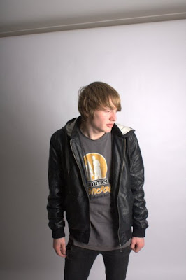
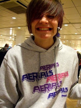
below are unedited pictures of 3 different people, Beau Green, Jacob Irons & John Atkinson, that i have considered to be in my final project. i have decided on these because their style fits that of my music magazine such as the generic style of rock/metal, for example, the uncaring punk rock looks on their faces and also, the darker clothing that doesnt use major designer labels, but more plain block colours to emphasize going against the fashion trends to create an individual and simplistic style, which also shows the careless attitude that my magazine wants to convey as the rips and tears in the skinny jeans for example, show a more hardcore attitude instead of wearing brand new clothing. Also, they are keen on the type of music that would be in the magazine and therefore know the generic style of the magazine to give better photos. luckily, we managed to borrow a whitescreen to therefore have better options when editing photos easier.


Thursday 4 February 2010

The Soloist


Release date(s)
24 April 2009 (US)
11 September 2009 (UK)

Distributed by
DreamWorks (US)
Universal Studios (international)
Working Title

Gross revenue
$31,720,158 (worldwide)

Budget
$60 million
Genres
Drama,Musical/Performing Arts

Starring
Jamie Foxx
Robert Downey Jr.
Catherine Keener

Awards
In 2010 The Soloist is nominated for the Black Reel Best Actor Award for Jamie Foxx

Advertisement
Posters
Websites
Billboards
Merchandise

Wednesday 3 February 2010

Mock - Up


Out of all the mock up covers i did, i believe this one was most effective at being a very realistic magazine cover which attracts the target audiences eye and uses the stereotypical conventions of a music magazine to their full potential, for example, i have used the black and white effect to make the main image unique and stick out from the page, but with it also effectively following the font's colour pallette. I also used the gradient tool for the background to make it look like the main image is lit up from underneath, emphasizing the live music effect that my magazine is trying to achieve. Also the use of a microphone in the picture emphasizes the live music effect perfectly and also makes the picture like a unique shot, taken by a professional photographer at a live music event. the black and white theme that i shall use consistently throughout my magazine will eliminate any problems that could occur due to lighting conditions on the main photoshoot. hopefully i want to achieve this simplistic but effective style in my final piece, but am still unsure about the pose that my model shall do to create the same effect but maybe in different positions that i shall experiment with during my photoshoot and pick the most effective pose to be on my front cover, to comprise my draft cover as a whole and compare it to this which should be inferior to my actual draft due to the limitless capabilities of the photoshoot, so that my draft and final cover catch the readers attention to the main article swiftly and more effectively than this mock - up.

Mock-Up Practices

below, you will find many different mock ups of magazines that i have created to try and find the best effects, locations, poses and layouts to create the a very individual and unique music magazine i also experimented with different fonts which after trial and error, i found appropriate fonts to use on my magazine. i believe that experimenting with all of photoshops features, i have been able to create a better, mock- up piece which should result in a better overall draft and final piece.


Monday 25 January 2010

Photo Scene's

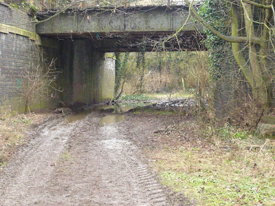
i have taken various pictures trying to find an effective setting in which to do my photoshoot or as a sort of background for my main image to sit on to contrast the image but still convey the rock/metal influence of the magazine.
for example i have taken pictures in the graveyard, the church, on empty roads and by a bridge which i believe are quite promising places for the photoshoot, or to be edited and used as a background setting for my main image.
below are a few of the pictures i have taken.