Showing posts with label Magazine Cover. Show all posts
Showing posts with label Magazine Cover. Show all posts
Thursday, 25 March 2010
Thursday, 11 March 2010
Draft Piece Remade


I have decided to change my colour scheme, and main image as from my feedback i have found that beau does not convey the right amount of energy for my genre of magazine. Instead, i have used Beth Greaves, who gives my magazine a more hardcore rock effect and appeals to the male audience due to the raunchyness of the main image. this is just a rough copy as it will get edited further during production but this is now my idea for my magazine.
Thursday, 11 February 2010
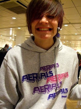
Coursework Draft Pieces


 i have used boxes to convey where the text for my main story shall be although, being unable to access my blog over the half term due to going on holiday without internet, i shall write a story while i am away
Thursday, 7 January 2010
Music Magazine Moodboard
 My moodboard has elements of everything i wish to put in my music magazine, for example it has a variety of colour schemes to choose from, inspirational titles and magazine covers to inspire the layout and style of my magazine cover, an array of fonts that may influence the written style of my magazine and i uploaded an array of pictures of bands and musical influences of mine which i would like to use their style of music as a main influence over the genre of my magazine and incorporate things such as their clothing ranges that i have uploaded pictures of people modelling (such as Drop Dead Clothing and Babycakes Clothing) to incorporate a musical fashion element to my music magazine setting it apart from others on the same target market audience.
Wednesday, 14 October 2009
Preliminary Task Magazine Cover


I worked with Paul Briggs, and we managed the task between us by each making a basic magazine cover and putting them together, we both took a number of pictures, so that we had a decent spectrum of pictures to choose from, which helps as it shows that we can select the best pictures to use for our magazine so that it can look as good as possible.
We used the school website and newsletters as inspiration, but added our own personal touches to improve the basic school format, such as an updated logo appealing to a more teenage audience with a bright cyan colour and black stripes contrasting on the school emblem.
We used computers with Adobe Photoshop to complete this task, as Photoshop has all of the tools needed to create a magazine cover, such as layers, effects, and the range of photo editing tools that can be used to do a variety of things to make the magazine cover pictures and text look the best that they can.
When planning, we had to take into account the audience and what information would be needed to be used, during shooting the pictures we took into account the relevancy of the pictures in contrast to the information on the page, and whilst editing we took into account the rule of three colours and three fonts, and also we took into account the basic layout of a magazine cover, that can be used to make our magazine look very professional and publishable.
I believe the consistency of the magazine layout worked well, as all font styles and layout colours were the same from both the magazine cover and contents page, and use the traditional basic magazine layout, where the masthead is on the top of the cover to keep a very simplistic but effective layout. We kept the colour palette to the school colours theme with turquoise and black fonts, and with cyan, yellow and white as a background colour to contrast the text on the page so it stands out effectively. The colour palette appeals to a teenage audience as it uses bold and bright colours, whilst still using dull colours to show the more adult like and professional look, which shows sensibility and practicality as the text contrasts well with background images and background colours.
If we had more time/ another chance to do this I believe we would use a variety of different Photoshop tools to make our magazine cover work a lot smoother, as the colours scheme is very block coloured. Also we could have taken more pictures, to have a larger variety of options for the front cover and therefore improving the overall look of the magazine/
From completing this task, I have learnt a variety of things, mostly how to use Photoshop tools effectively and have improved on using the magnetic lasso tool, which in future will help me with other picture related work. I also have learnt further aspects of magazine covers such as the placement of pictures, and text on the page to be effective and follow traditional magazine layouts.
Wednesday, 7 October 2009
Rocksound Magazine 'Mock- Up'

 This magazine has a traditional basic magazine layout, where the masthead is on the top of the cover to keep a very simplistic but effective layout. the colour pallette uses yellow, white, and a variation between different shades of blues and turquoise which does not comply to the rule of three but, the extra colour is for added effect among text to emphasise it's meaning, and also contrasts well with the picture and background to stand out on the page. This is used for simplicity as the picture can contrast well against the background. The colour palette shows a teenage/ adult audience as it doesnt show extremely bright colours that may attract a younger audience, but more toned down and relaxed colours. By doing this 'Mock-Up' of a magazine cover i have learned various things for example the basic rules for a magazine cover, how a basic layout can be very effective, and how contrasting slightly text colours from background images and colours distinguishes and makes text stand out and more appealing on the page.
Subscribe to:
Posts (Atom)