Wednesday 24 February 2010
Editing Techniques Paramore - The Only Exception
This music video starts with Hayley sleeping next to a man on a sofa, suggesting a loving happy atmosphere of harmony. when hayley wakes up, using a jump cut from a closeup of them on a sofa to an establishing shot as she gets up off the sofa and slowly zooms back in on hayley, which then uses a jump cut to a low angle close up of Hayley writing a letter, which could portray power to the audience which then uses a jump cut again to the 'Im Sorry' written on the letter which cross cuts so when the camera is back to Hayley, she's walking out of the room.
as she is about to leave the room she stops and the camera uses the cutaway technique to show us she is looking at the man still asleep on the sofa before turning away and exiting the room, suddenly the camera cuts to the other room with her father in, which jump cuts to a flashback of her hugging her Father, and when their embrace ends it jump cuts again to Hayley looking at a picture, which then jump cuts to an establishing shot of the room with her standing looking at the photo and her father sitting at the table looking at her as she sits down. there are a few jump cuts of Hayley and her Father talking until she embraces him with a hug again, which jump cuts again to show the whole room as Hayley leaves her dad to walk through the second door, which directly leads to her bedroom, jump cutting to her putting the picture she was looking at on her mirror, which jump cuts again to a zoomed in shot of the picture on the mirror of her mother and father with the focus blurring in and out of the picture and hayleys reflection in the mirror.
Monday 22 February 2010
Thursday 11 February 2010
Coursework Draft Pieces


 i have used boxes to convey where the text for my main story shall be although, being unable to access my blog over the half term due to going on holiday without internet, i shall write a story while i am away
Font Colour
For my draft cover, i have decided to break the stereotypical conventions of a magazine much like many kerrang/ rocksound magazines do to emphasize effect and add a more eye-catching touch to the text as my cover picture and picture in the contents page are in black and white, and thus, have decided on a black,white,blue and green colour scheme.
Monday 8 February 2010
Possible Magazine Models & Photoshoot
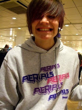
below are unedited pictures of 3 different people, Beau Green, Jacob Irons & John Atkinson, that i have considered to be in my final project. i have decided on these because their style fits that of my music magazine such as the generic style of rock/metal, for example, the uncaring punk rock looks on their faces and also, the darker clothing that doesnt use major designer labels, but more plain block colours to emphasize going against the fashion trends to create an individual and simplistic style, which also shows the careless attitude that my magazine wants to convey as the rips and tears in the skinny jeans for example, show a more hardcore attitude instead of wearing brand new clothing. Also, they are keen on the type of music that would be in the magazine and therefore know the generic style of the magazine to give better photos. luckily, we managed to borrow a whitescreen to therefore have better options when editing photos easier.


Thursday 4 February 2010
The Soloist

Release date(s)
24 April 2009 (US)
11 September 2009 (UK)
Distributed by
DreamWorks (US)
Universal Studios (international)
Working Title
Gross revenue
$31,720,158 (worldwide)
Budget
$60 million
Genres
Drama,Musical/Performing Arts
Starring
Jamie Foxx
Robert Downey Jr.
Catherine Keener
Awards
In 2010 The Soloist is nominated for the Black Reel Best Actor Award for Jamie Foxx
Advertisement
Posters
Websites
Billboards
Merchandise
Wednesday 3 February 2010
Mock - Up

Out of all the mock up covers i did, i believe this one was most effective at being a very realistic magazine cover which attracts the target audiences eye and uses the stereotypical conventions of a music magazine to their full potential, for example, i have used the black and white effect to make the main image unique and stick out from the page, but with it also effectively following the font's colour pallette. I also used the gradient tool for the background to make it look like the main image is lit up from underneath, emphasizing the live music effect that my magazine is trying to achieve. Also the use of a microphone in the picture emphasizes the live music effect perfectly and also makes the picture like a unique shot, taken by a professional photographer at a live music event. the black and white theme that i shall use consistently throughout my magazine will eliminate any problems that could occur due to lighting conditions on the main photoshoot. hopefully i want to achieve this simplistic but effective style in my final piece, but am still unsure about the pose that my model shall do to create the same effect but maybe in different positions that i shall experiment with during my photoshoot and pick the most effective pose to be on my front cover, to comprise my draft cover as a whole and compare it to this which should be inferior to my actual draft due to the limitless capabilities of the photoshoot, so that my draft and final cover catch the readers attention to the main article swiftly and more effectively than this mock - up.
Mock-Up Practices
below, you will find many different mock ups of magazines that i have created to try and find the best effects, locations, poses and layouts to create the a very individual and unique music magazine i also experimented with different fonts which after trial and error, i found appropriate fonts to use on my magazine. i believe that experimenting with all of photoshops features, i have been able to create a better, mock- up piece which should result in a better overall draft and final piece.


Subscribe to:
Posts (Atom)